Which Photo Should Lead Your Listing? A Side-by-Side Comparison
Compare an exterior, kitchen, living room, and lake view to choose a truthful, distinctive listing cover. See how the crop changes the story.
da Rex HanOriginally published on ActiveRain
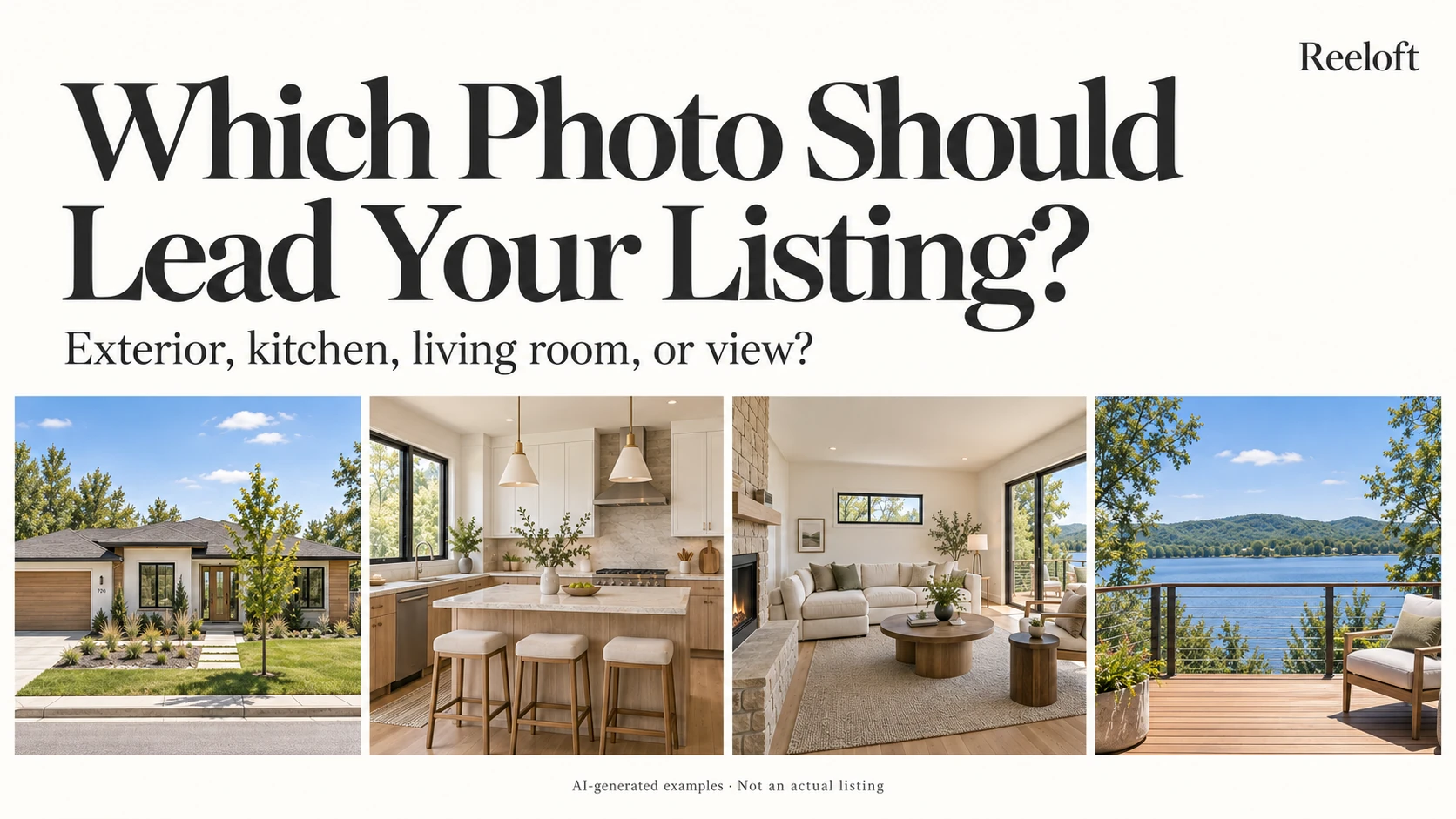
You have the finished photo gallery: a welcoming exterior, a bright kitchen, a comfortable living room, and a beautiful view. Which one goes first?
The exterior is an understandable starting point. It introduces the property immediately. But before choosing it automatically, I would ask one question:
Which image gives someone the clearest, most compelling reason to explore this particular home?
That answer can change from property to property. Here is how I would compare four possible lead photos.
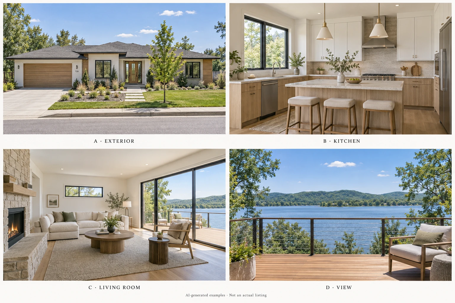
A. The exterior: introduce the property
An exterior photo can explain a lot at once: architectural style, the entrance, landscaping, and how the house sits on its lot.
I would consider leading with it when the architecture or curb appeal is a defining feature, or when an interior image would leave too much uncertainty about the property itself.
The tradeoff: an attractive frontage may still leave the home's most distinctive feature out of sight. In our example, photo A introduces the house clearly, but gives no hint of the lake behind it.
Before choosing an exterior, check whether the house remains easy to recognize when the image is small. Too much street, sky, or driveway can leave the actual home feeling secondary.
B. The kitchen: highlight a standout feature
A kitchen can make a strong opening when its layout, light, finishes, or connection to nearby rooms helps explain what is special about the home.
Choose a photograph that shows the space, rather than just a close-up of a faucet or countertop. Those details can come later.
The tradeoff: a polished kitchen image does not necessarily tell someone much about the rest of the property. In photo B, the island and cabinetry are appealing, but they give us less information about this home's lakeside setting.
My question would be: does this kitchen distinguish the listing, or is it simply a well-photographed room?
C. The living room: connect the spaces
A living room can bring several features into one frame: natural light, ceiling height, a fireplace, seating space, and access to the outdoors.
Photo C is especially useful because it connects the interior with the deck and lake beyond. It gives the view some context: we can see how it relates to the space inside.
The tradeoff: a wide room photograph can lose its meaning if the crop removes the very features that made it interesting. Furniture should help explain the space without overwhelming it.
For this example, I would shortlist C because it tells a more complete story in a single frame.
D. The view: show what is hard to replicate
A view deserves consideration when the outlook from the property is one of its defining features.
Photo D includes the deck in the foreground. That detail matters: it helps explain where the viewer is standing, instead of presenting a landscape with no connection to the home.
The tradeoff: the view alone does not explain the home's architecture, condition, or interior. If I opened with D, I would follow it quickly with photos that answer those questions.
For an actual listing, use a truthful image taken from the property. A nearby scenic viewpoint would tell a different story.
Which would I choose here?
For this imagined home, I would start with C, the living room, and place D, the deck view, next. Together, they introduce the interior and then give the setting more room to speak for itself.
I would bring the exterior into the opening few photos so viewers can understand the house as a whole. The kitchen would follow as part of that introduction.
That is an editorial choice, not a measured winner. If the architecture were the standout feature, I might choose A. If a distinctive kitchen were the main reason to explore the home, I might choose B.
Check the crop before making the final decision
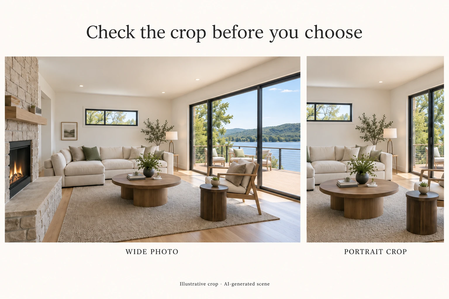
Preview your shortlisted photo at the size and shape where people will actually see it. Check the listing thumbnail, social preview, or video cover separately.
In the example above, the narrow crop loses the fireplace and much of the lake view. The sofa is still attractive, but the image communicates less about the property.
If a crop removes the reason you chose the photo, adjust it, use another image, or ask your photographer for a composition suited to that format.
Before publishing, ask:
- Can someone understand the subject at a glance?
- Does it show something distinctive about this property?
- Does the intended crop preserve that feature?
- Does it represent the property accurately?
- Does the next photo help explain what the first one leaves out?
Also check any cover-photo requirements for the place you are publishing.
The same thinking is useful when turning a photo gallery into a listing video. At Reeloft, we help turn property photos into videos; choosing a clear opening image is part of deciding how to introduce the home.
Related reading: Real Estate Photos Into Videos Without Adding More Work.
Which would you put first for this example: A, B, C, or D? What would make you change your choice?
Put your listing photos to work
Start with approved property photos or a supported listing link, then review and edit your video in Reeloft.